mobile point of sale
One of the biggest pain points that small business owners have is getting paid on time. A lot of our users collect money in person at the job site after completing the job. From research, we learned that a lot of customers use mobile point of sale devices to take payment.
We realized that there was a big opportunity for us to integrate a mobile point of sale solution within our experience. As a business this would allow us to increase our payment volume. Additionally, our users would be able to manage their business within one app. Currently users would use Invoice2go send invoices, but then have to switch to PayPal or Square to collect payment. We wanted to offer one solution to handle both. An important part of this project was that we were able to partner with PayPal. PayPal would provide their PayPal Here devices for our customers. We needed to create the experience within the app to use the devices.

OUR GOAL
Our goal was to create a simple solution for business owners to collect a card payment on the spot. We needed the feature to be quick to access and not buried away within the app, especially if the business owner is on a client’s site.
High level goals:
Entry point to access the feature and trigger the flow to accept payment
Onboarding flow to get business owners setup (Invoice2go vs PayPal experience)
A way to manage different POS devices
Create an intuitive payment experience
MY ROLE
I was the lead designer for this project. I worked with a product manager, iOS lead, Android lead, and 3 backend engineers. Additionally, I was involved in multiple meetings with that PayPal team to review design specs and requirements.
INTERACTION DESIGN
Entry point
We identified three potential spots to surface the feature for discoverability. (1) On the home screen. Rather than having a static banner, we looked at making it smart by triggering it to only show if knew that the business owner was at the clients location. (2) Triggering a dialog when you open the invoice. While this would be guarantee visibility, it disrupts a users workflow. (3) In the notifications list add a card that would sit with the rest of the notifications. We knew this was a high touch area, because from data we saw business owners frequently navigate to their notifications to check to see if any new payments came in.
Within each invoice, we added in a way for business owners to quickly access their MPOS device and collect a payment. The existing experience already had a payment center for each invoice so we expanded the list of options to include the mobile payment option. Additionally, we realized that we could communicate the state of the MPOS device (active or not) in this section. We had three states: (1) If the business owner did not have a device, we gave them an entry point to sign up and get one. (2) If the MPOS device was active we would let them know that the device is ready to accept payment. (3) IF the MPOS device was not connected we would let them know to connect the device (enabling Bluetooth, etc).
onboarding
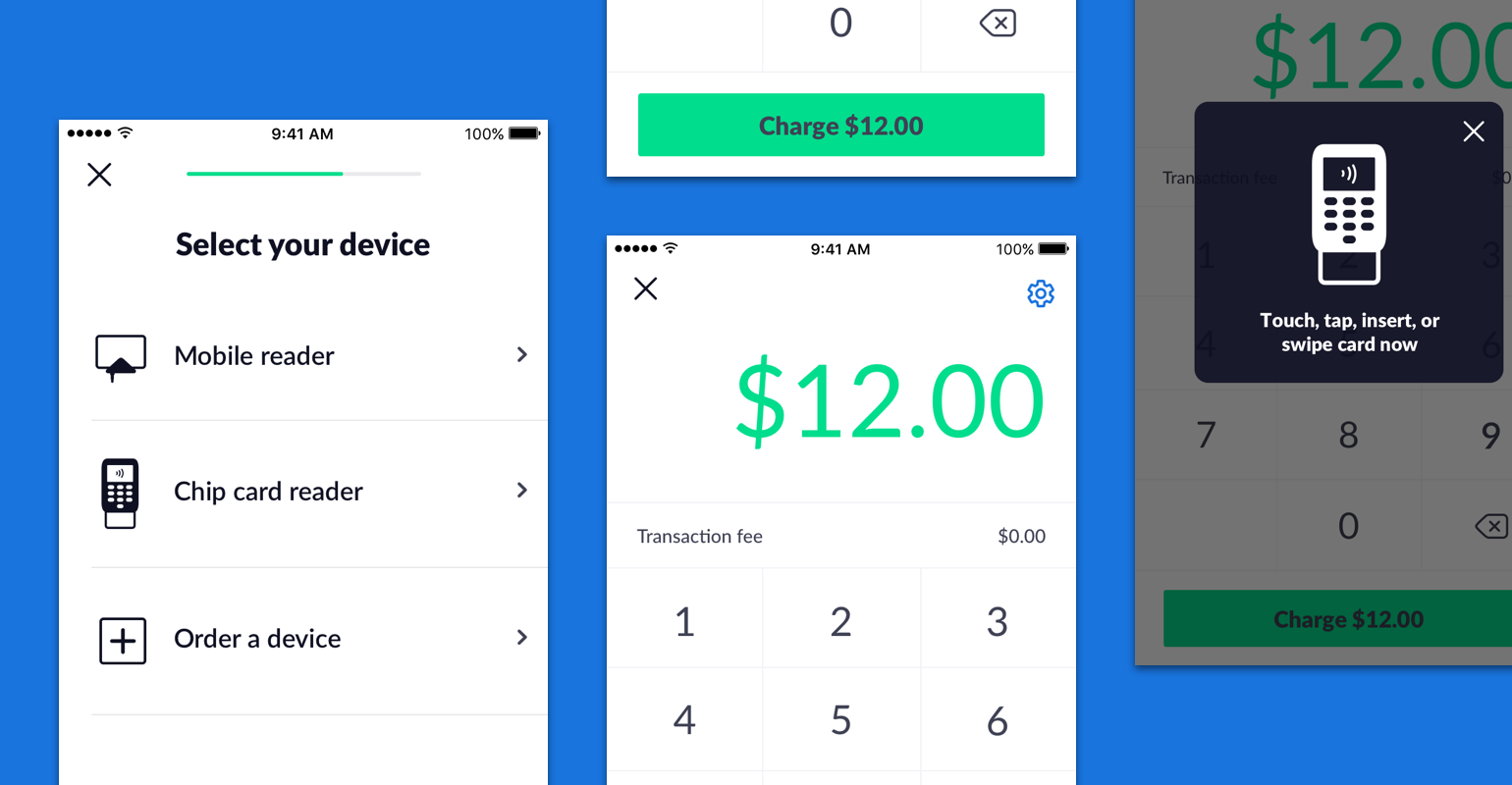
The onboarding flow was a key part of the design. We hypothesized early on that this is where we would see the most drop off, so we wanted to make this as seamless as possible. We partnered closely with the PayPal team to make sure we were meeting their requirements. As part of this flow, our business owner would have to create an account with PayPal (if they did not have one already) and then be able to purchase a device. Managing the transition between our experience and PayPal’s experience was a big challenge for us. We spent time iterating on this and running numerous usability tests.
Management
We created a section within payment settings to help business owners manage their devices. This is where they could go to add a new device, deactivate a device, check on account status.
payment
The final piece was the payment experience itself. This was the repeat experience and we wanted this to feel simple and quick. Taking advantage of the PayPal here API, we were able to indicate to the business owner the steps to collect payment. We worked with PayPal to allow us to control this part of the experience as much as possible to avoid context switch between our app and PayPal.
FINAL DESIGNS
Entry point
We worked on building a smart trigger that would show up if the business owner was at the client’s address. We used the address that was on the invoice to determine when to trigger the banner.
onboarding
It was important that the onboarding experience felt seamless. It was important that users got through the flow to adopt the product. To reduce clutter, we separated the steps into independent screens. Previously, we had tested a variation with all the steps on one screen. We noticed that there was a higher drop off during testing when all the steps were on one screen.
Management
payment
FINAL outcome
We launched to 20,000 business owners across different business segments
We saw a high adoption across contractors/ plumbers/ electricians/ etc, but low adoption from other business types
Biggest drop off point was during onboarding - we worked with the PayPal team and iterated to reduce the number of total steps and hand-offs between our experience and PayPal
MPOS processed payments accounted for ~15% of our total payments volume month over month


